When a Brand Looks Different But Somehow Feels the Same
A few weeks before Coachella 2026, billboards started popping up along the desert highway. Pink background. Hot-pink type. Daisies scattered across the frame. Anyone who follows Rhode, Hailey Bieber’s skincare brand, did a double take — this wasn’t Rhode’s usual look at all. The brand built its reputation on cool grays, clean whites, and quiet Swiss-style minimalism. So what was this? A rebrand? Or something else entirely — a case of brand identity flexing that most people mistake for a full identity change?

What Brand Identity Flexing Actually Means
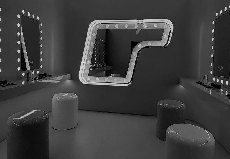
Not a rebrand — a flex. What Rhode did was a controlled stretch of a system already strong enough to bend without breaking. The pink, the daisies, the looser energy: all of it was built for one collaboration, tied to Justin Bieber’s Coachella set, aimed at one specific audience in one specific moment. Rhode built its first-ever immersive pop-up at the festival, a full experience with dart games, plushies, touch-up rooms, themed cocktails and a chrome sphere that stopped everyone in their tracks — without ever touching its actual logo or core visual system. That’s brand identity flexing in its purest form: temporary, intentional, reversible. The core identity never moved. Brands with real equity don’t reinvent themselves every season — they earn the right to play, because people already recognize who they are underneath the play.
The Question Worth Sitting With
So here’s the real test: could your brand pull off the same move? If you swapped your palette or loosened your tone for one campaign, would your audience still recognize you — or would they wonder if they’d landed on the wrong page? A logo is easy to redesign. A brand people recognize without needing to see the logo at all takes years of consistency most companies never build — which is exactly why so few can afford brand identity flexing the way Rhode just did.
What are you going to do?
This is the work we do every day: building brand systems solid enough to flex without losing their identity. Not just logos — the full architecture of tone, color, typography, and voice that lets a brand show up differently and still be unmistakably itself. If this got you thinking about where your own brand stands — strong enough to flex, or still finding its footing — that’s a conversation worth having. Let’s talk about it.